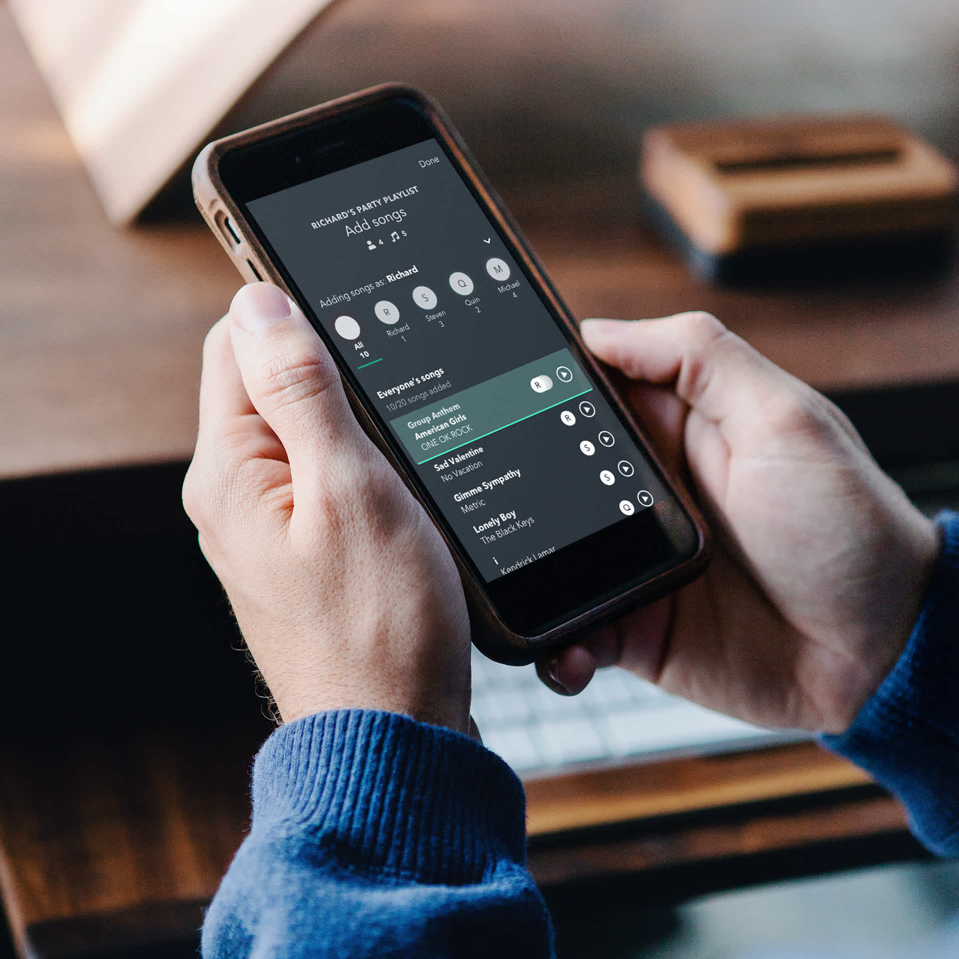
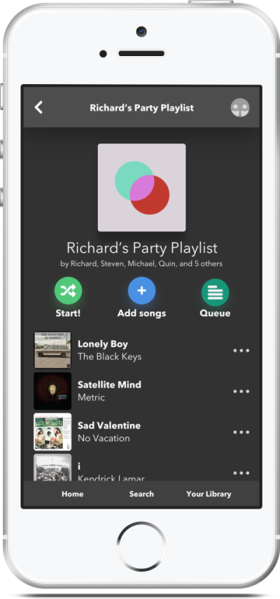
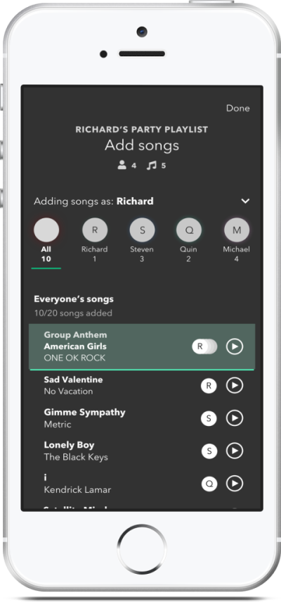
The problem: how can party playlists help people bond over music?
Every year, my cousins and I use Spotify create summer-themed collaborative playlists, or party playlists, as a fun way to bond with each other. However, we often run into issues, such as unclear rules or confusing interactions, that lead to frustration.
I took on the challenge of redesigning my family’s Spotify party playlist experience in order to understand how close-knit groups of friends or family can bond over music. I believe that music apps such as Spotify can do better at empowering groups of people to share and play music together.
The solution: a seamless way to create party playlists with friends
Party Mode brings an old twist to new technology letting you and your friends easily create collaborative playlists for your get-together. It’s perfect for special gatherings or bonding activities, from road trips to game nights.
The design process
Researching the user
To understand the frustrations with party playlists, I asked a few people—mostly my cousins—about what issues they run into when creating playlists and/or collaborative playlists in Spotify.
Interviews: what problems do you have with creating Spotify playlists?
Although most respondents frequently used playlists to listen to music, they also felt that there were little interactions in creating Spotify playlists that were tedious or unclear.
With regards to collaborative and party playlists, interviewees were mixed as to whether using them was a simple, intuitive, and/or fun experience.
Spotify playlist pain points
“Adding songs to collaborative playlists, and just playlists in general, is so tedious.”
“I get frustrated when I want to create a playlist, but I can’t find the right button to do so. It’s harder than it should be.”
Collaborative & party playlist pain points
“Collaborative playlists are a very convenient way to share songs, but sometimes it’s a hassle to take out your phone and add songs, like when everyone’s busy doing something, or when we’re in a car.”
“There definitely needs to be a way to limit how many songs everyone can add. Even if we tell everyone to only add a certain number of songs, we can’t actually stop them from adding as many as they want.”
Users found the process of creating a playlist and adding a song in Spotify to be cumbersome.
User persona – who suffers from these pain points?
With these insights, I created a user persona named Sasha who represents the kind of person that regularly runs into these pain points.
Sasha…
is a young adult who enjoys spending quality time with her friends and family.
values get-togethers with these people, such as hiking trips or board game nights.
uses party playlists as an activity to engage people during these get-togethers.
is frustrated by how Spotify’s UI can make the process of creating a party playlist needlessly slow or confusing.
Customer journey map – what does the problem scenario look like?
We’ve established that Sasha values bonding time with her loved ones. To map out one such scenario, I created a customer journey map. It walks through a story in which Sasha’s need arises and is solved through the use of a party playlist. Here, we can see both how Sasha’s party plays out on the surface and her unseen thoughts and emotions.

User flow – chunking the party playlist into tasks and mental models
After mapping out the customer journey map, I created a user flow tracing the steps Sasha and her friends would follow in creating a party playlist. It serves as an outline for which screens will appear in the solution.
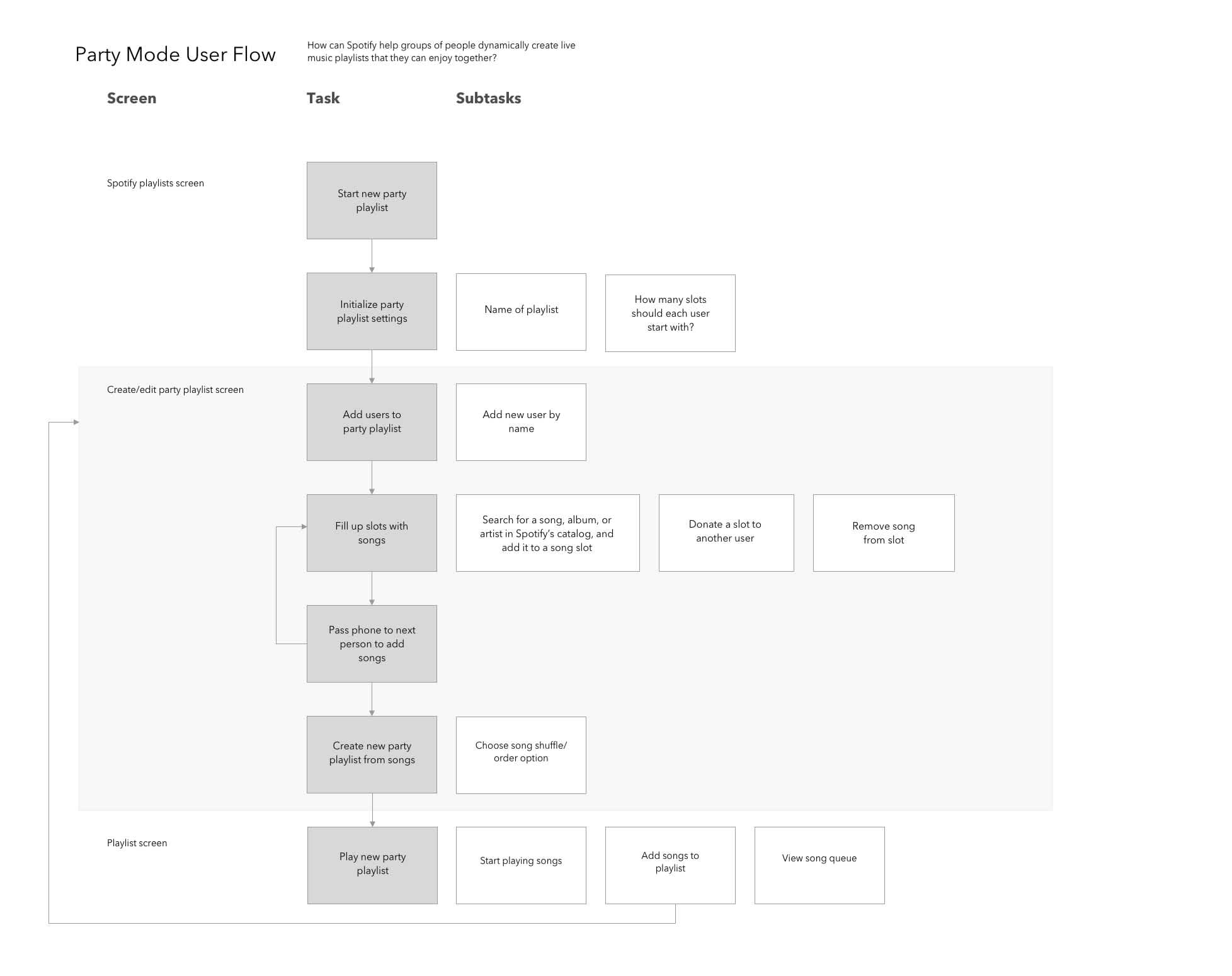
In my opinion, one of the most useful outcomes of creating a user flow was that it gave me an idea of which mental model(s) Sasha would use by considering how Sasha would expect to, and ultimately approach, each task.
Designing a solution
I reworked my family’s party playlist process into something more streamlined and less chaotic that Sasha could use at her get-togethers. In this section, I’ll go over how how I approached the design of two specific features:
The slot system—a system of tracking who added which songs, and allowing users to add or trade slots for songs.
The add-songs feature—simply searching for, and adding songs to a playlist.
V1: Initial sketches – working within familiar behaviors
The initial sketches sought to establish a process for creating party playlists that was efficient and intuitive while not straying too far from the familiar. For instance, as seen below, I chose to “attach” the slot system to the more familiar add-songs screen.

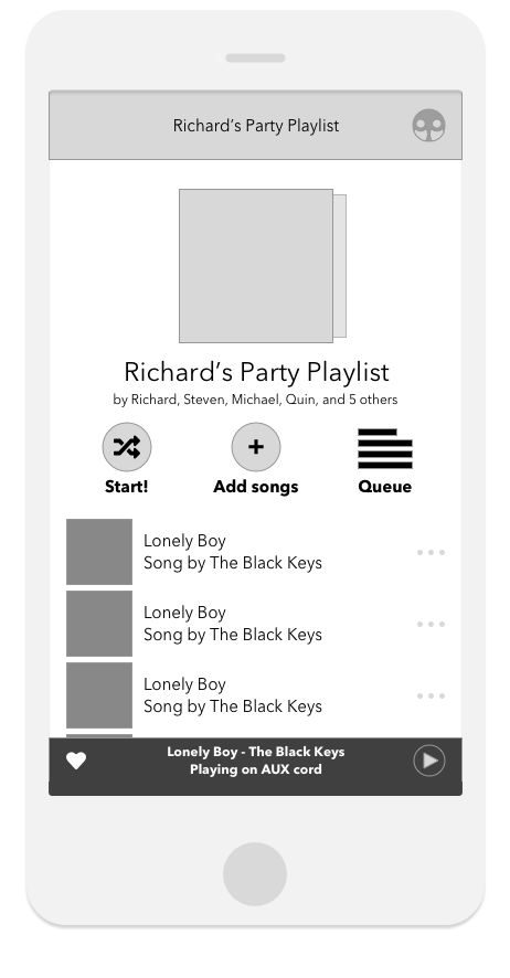
Searching for, and adding songs was much more intuitive than existing solutions
I moved Spotify’s entire “add songs” process to a bottom sheet pop-up, so users could search for and add songs to their playlist right away. Testers thought this process was much simpler than Spotify’s default solution.
(At the time of writing this case study, Spotify did make the add-songs process far easier to use in a future update, similarly to how it’s sketched here! Awesome!)
A lack of information about the slot system confused testers
Making the slot system as subtle as possible actually made its purpose unclear to users. I realized this in testing, when testers expressed confusion at, or completely missed, the feature, due to a lack of clarity.
V2: Iterated wireframes – fleshing out the slot system
Using feedback from testing the first sketches, I knew that I needed to add a bit more information about the slot system so people could know how it worked.
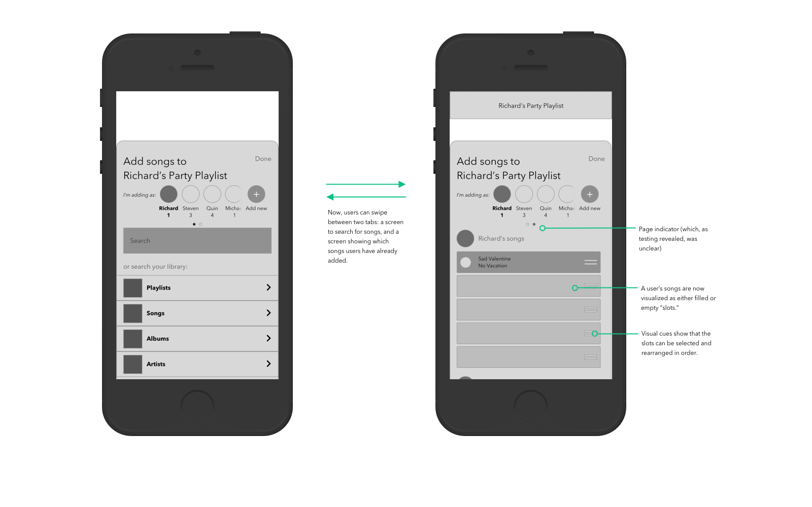
I was still cautious to introduce anything too novel that would stray from Spotify’s existing design system in order to avoid overloading users with new elements.
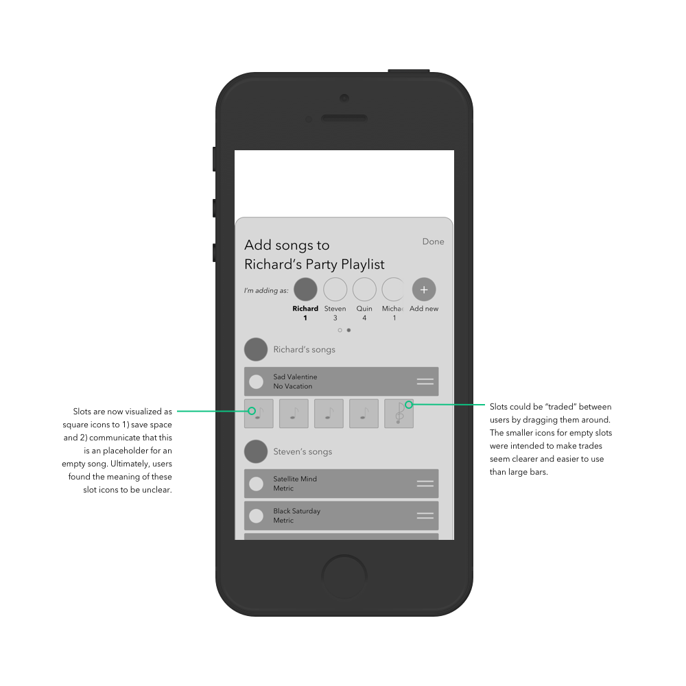
V2 insights
Slots were still hard to identify and locate
In response to feedback about the slots being confusing, I made a quick hotfix by turning the full-width slots into square icons. I believed this would be helpful by saving space and communicating that slots are placeholders for actual songs. However, this still didn’t fix the core problem of the slots being hard to find.
The slots system was hard to find (and still confusing)
As it turned out, separating the slots into another tab didn’t make them more visible. In fact, because the slots were hidden by default, users overlooked them entirely. And even when I pointed this out, they weren’t convinced that the slots were useful or relevant to the party playlist.
V3: Iterated wireframes – leaning in, rather than staying subtle
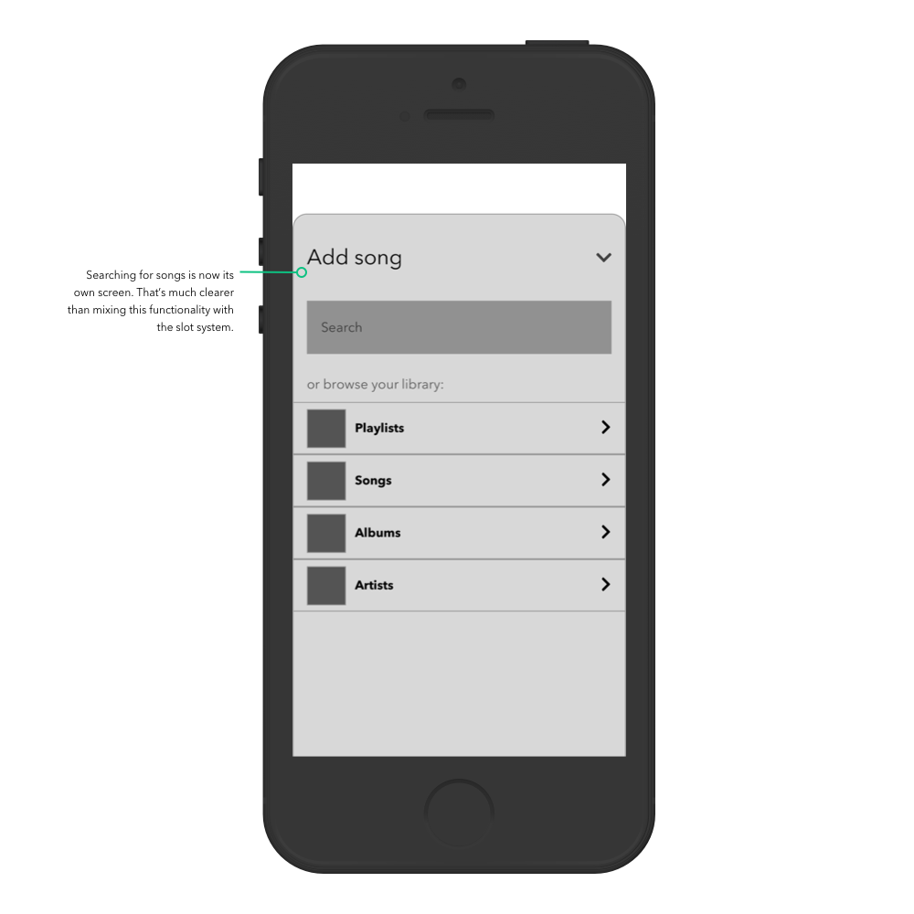
I revisited the initial assumption that attaching a complex feature (i.e. slots) to a familiar one (i.e. adding songs) would make the resulting “hybrid” feature clear to the user.
I decided to lean into the opposite direction: making the slot system as explicit as possible, by entirely separating it from the add-songs feature. This meant moving far away from a grounded interpretation of Spotify’s existing design system.

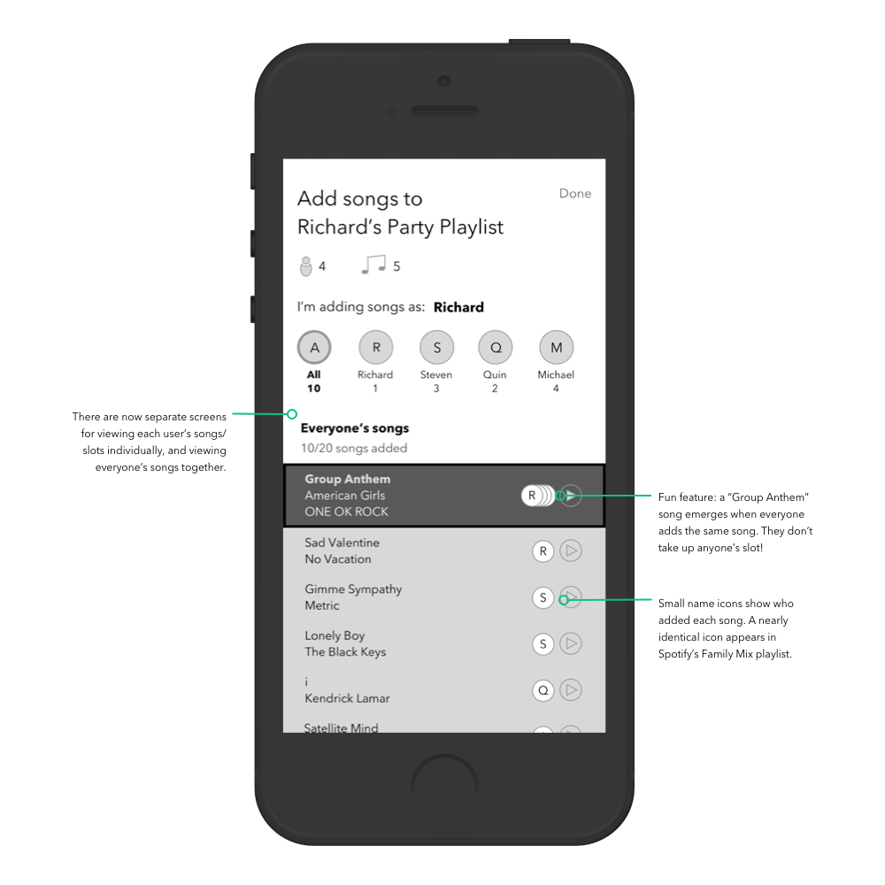
V3 insights
Slot system felt much more simple to use and understand
In testing, people found this iteration far clearer from the get-go. They were able to use the different features of the slot system right away, instead of brushing them off or getting confused.
This differed from my original assumption that people would find everything clear if every task was as similar to existing processes as possible. Instead, dividing complex tasks (slots & searching for songs) into separate screens helped people better understand the broader process of creating a party playlist.
High-fidelity visual design
The wireframes were finally coming together as a product people could actually use! I started making a high-fidelity prototype for testing, which was visually based on Spotify’s own UI design aesthetic.
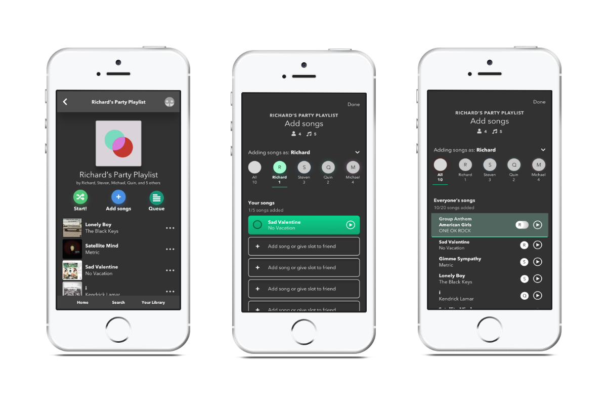
However, I felt that re-drawing all of the screens in high-fidelity seemed...limiting. Wouldn’t it be nice if people like Sasha could actually use the prototype to create real party playlists, instead of pretending to do so?
Interactive web prototype (with real(!) song data)
Rather than just create high-fidelity screens in Sketch, I decided to create an interactive, fully-functional web-based prototype using React, with the help of the Spotify API.
The prototype covers the same key tasks I covered in the previous sections: 1) using the slot system, and 2) adding/searching for songs.
Signing in with Spotify First, users sign into their Spotify account. The playlist will be created on their account.
Initializing the playlist Users give the playlist a name, set a default number of slots, and add users.
Building the playlist Next, users build their party playlist! They can add songs to their slots or trade slots with other users.
Creating the playlist in Spotify Finally, the playlist is ready to be made. Tapping “Create playlist” will send a request to the Spotify API to create a playlist with the selected songs.
User testing
Once I was satisfied with the coded prototype, I set up user tests with 7 people, both remotely and in-person.

Insights
Overall, the system was easy to use
6 out of 7 users found the app to be easy or very easy to use. 5 out of 7 users were likely to recommend it to someone they know.
Initial confusion about the slot system when starting
Testers were able to use the slot system—adding songs, knowing how many songs they were limited to, etc.—just fine. However, some were initially unsure or misguided about the purpose or function of slots and users.
“Friends might not like dealing with the hassle of switching users but I think it’s pretty simple to do.”
To relieve confusion, the app could benefit from being more explicit in guiding users on how to use these features, e.g. by having a short onboarding screen or tutorial. Furthermore, it would be worth considering ways in which the app can convey the value of having slots and/or users.
Needs work: Provide backup options for slot leniency
While users accepted the idea of picking songs based on how many slots they had, it seems that they would like the option to add more slots or to lift the slot limit entirely. In other words, the slot system could benefit from being a softer limit.
“The starting slots were a bit confusing at first because I would expect that everyone would be able to just add as many songs as they want.”
“How would I go back to add more slots later?”
Reflection
This project truly tested all of my UX skills and then some, from research to prototyping to testing to even coding. Here are some of my biggest takeaways for future design endeavors:
Don’t reinvent the wheel
I constantly found myself in situations where I spent too much time either building things from scratch or refining something that was already 80% complete. This was especially true while I was building the coded prototype.
In future projects, I could save a lot of time and effort if I make use of pre-made resources and assets, such as Bootstrap or Material Design for a React prototype.
Put your prototype in front of more people
This was an important project for my user testing skills because I’ve always been quite shy about asking people for feedback. However, I did base a lot of my design decisions off of assumptions about the user, rather than real feedback. In the future, I want to put more emphasis on validating decisions with data and feedback from real people.
Also, the feedback I received was largely based on either prepared questions or post-test reflections. In the future, I want to try asking people to describe their thought process live, as they’re using the solution.
Future considerations
In this project, I mainly focused on refining the slot system and the search feature. In the future, I hope to explore how the experience of playing music from a party playlist can be improved.
Thanks for reading! If you have any feedback, please get in touch! I would be happy to address any questions or comments about this project.
